Dashboard
The Dashboard provides a high-level overview of the velocity, shipping rate, and impact of your experimentation program.Scaled Impact
Scaled Impact provides an overview of how multiple experiments have influenced a key metric. All completed experiments that have the selected metric are included in this section.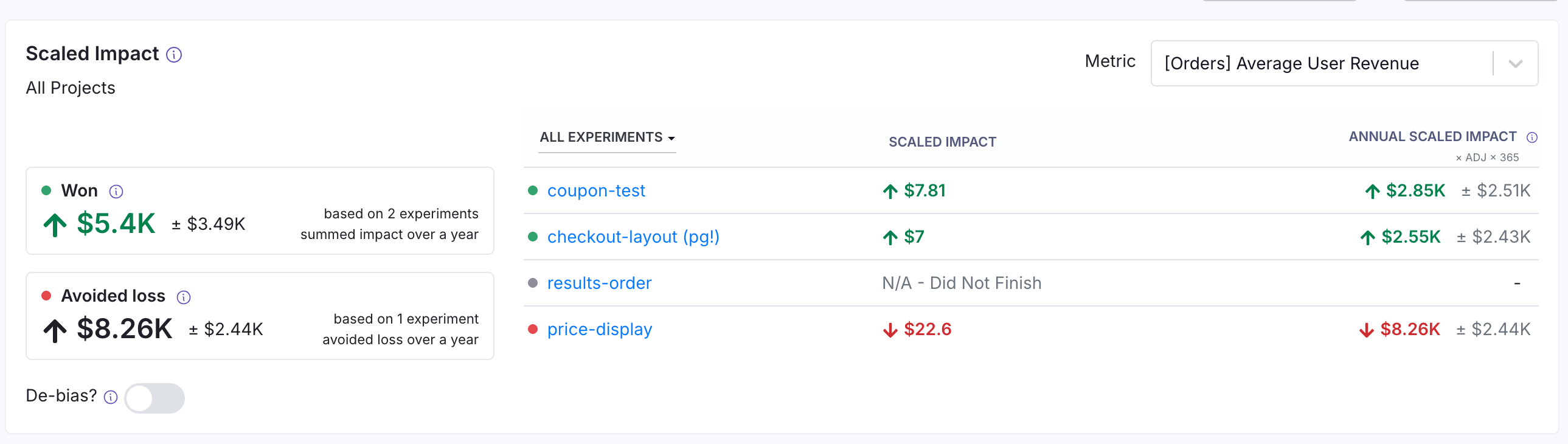
- “Won” experiments use the variant selected as the winner in the experiment metadata
- “Lost” experiments use the variation that performed worst relative to the baseline.
Details of scaled impact and de-biasing procedure
Details of scaled impact and de-biasing procedure
Scaled ImpactScaled impact rescales your experiment effect to answer the question: “What would the total effect be if all participants had received a specific test variant?” For example, imagine your absolute lift in an experiment is $0.30 per user with 100 users in that variation. If your experiment got 20% of total traffic, and it was split evenly so that each variation got 50% of the experiment traffic, then the total potential traffic was 100 / (50% X 50%) = 400 users. So, the scaled impact would be $0.30 X 400 = $120. It is a simple rescaling that makes some assumptions, but it does allow you to compare the effects of experiments on different parts of your product (e.g. a big change to a small feature vs. a small change to a big feature might have the same scaled impact).Total Impact, represented by the large Won and Avoided loss boxes, sums the effects of all experiments within a category. This assumes the effects are independent and not additive. This is not an assumption easily satisfied, but it allows you to get a general sense of scale.De-biasing is achieved through the positive-part James-Stein shrinkage estimator, which mitigates the natural bias in experiment outcomes (where more decisive results tend to show larger effects). This estimator adjusts the results by estimating variance only from the shown experiments and shrinks all impacts toward zero. While this reduces selection bias, it does not address concerns about the independence or additivity of experiments.
Win Percentage & Experiment Status
Win percentage shows the percentage of experiments that were stopped and marked as “won.” Experiment status shows the number of experiments completed in the selected time period and represents your experimentation program’s velocity.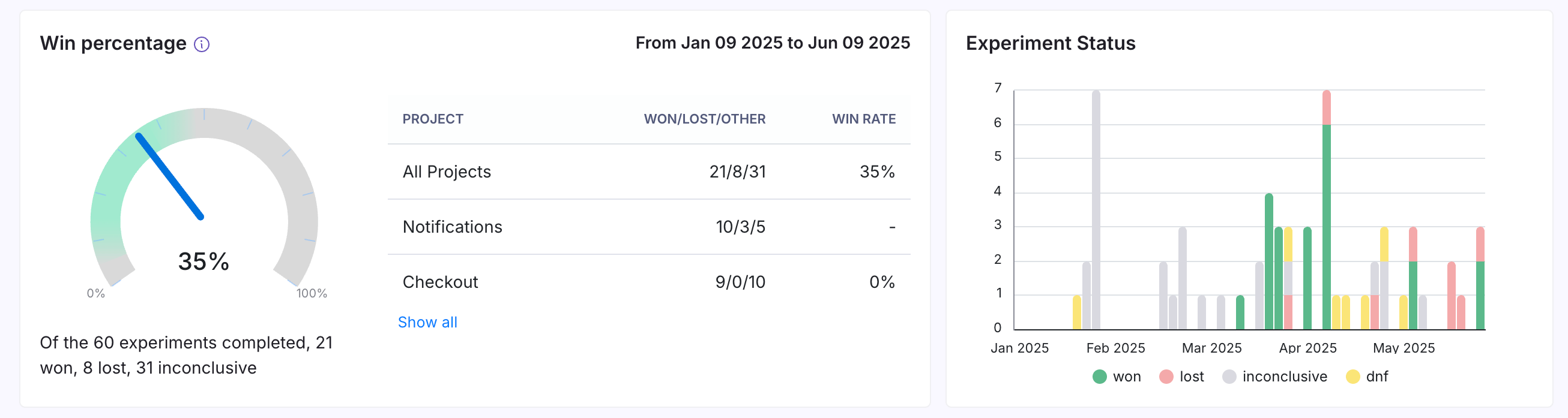
North Star Metrics
North Star Metrics are crucial, company-wide indicators of success. This panel displays how these metrics evolve over time and shows which experiments using this metric are running (or when they ended). If this panel isn’t visible, go to Settings → General to set up your North Star metrics.Learnings
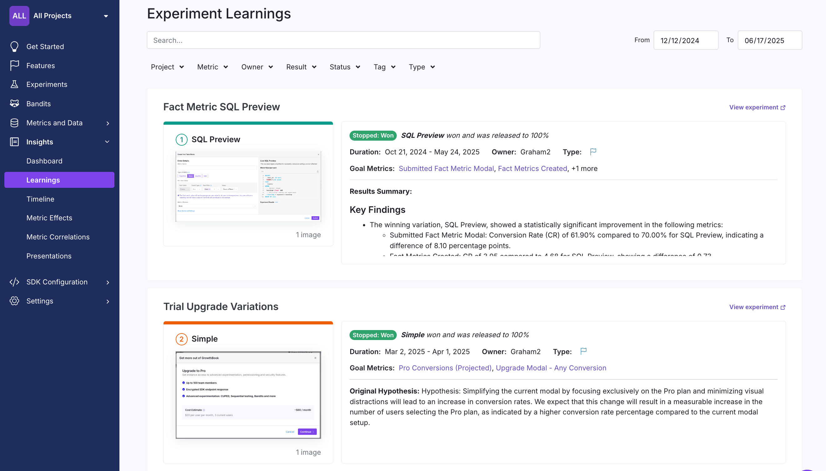
- The experiment decision (won, lost, inconclusive)
- Screenshots of the winning variation
- Additional experiment metadata
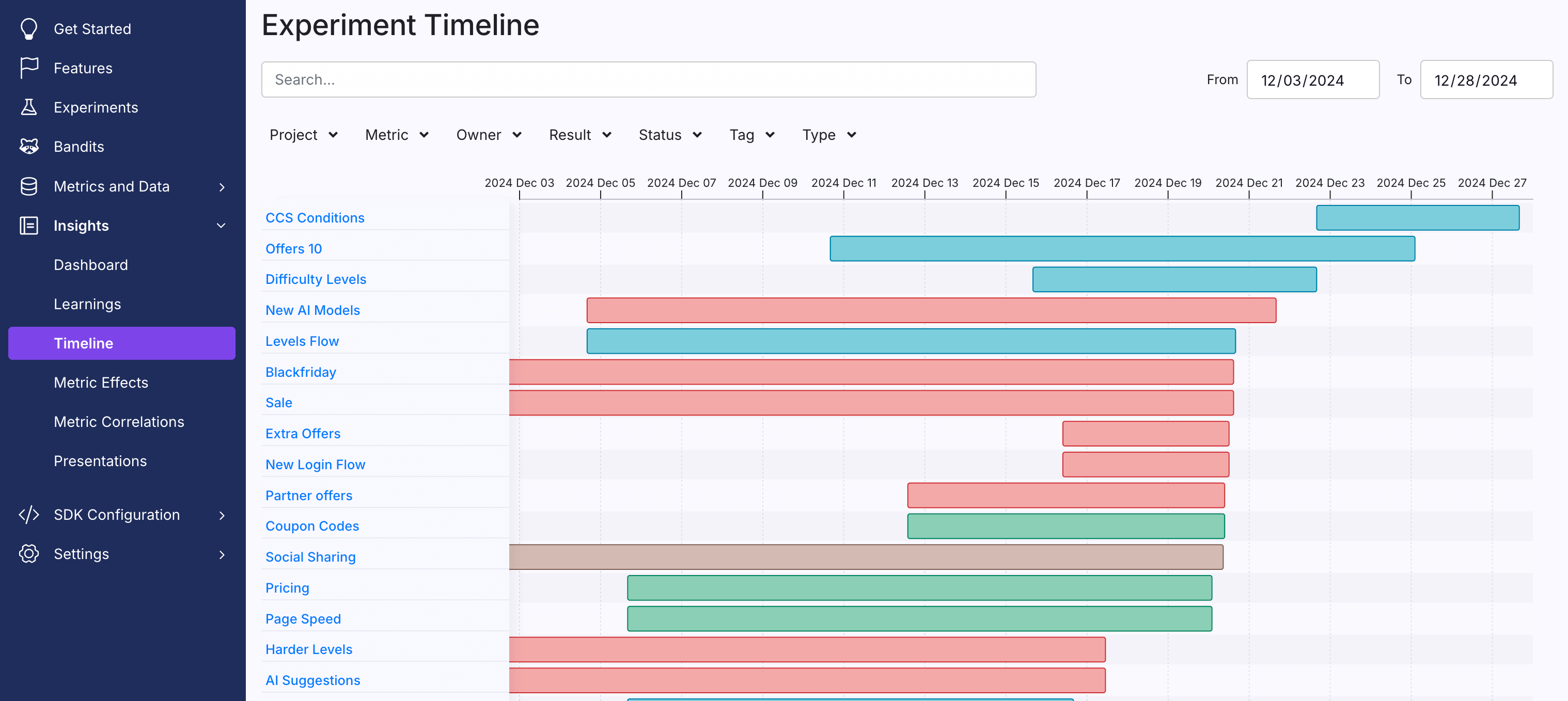
Timeline
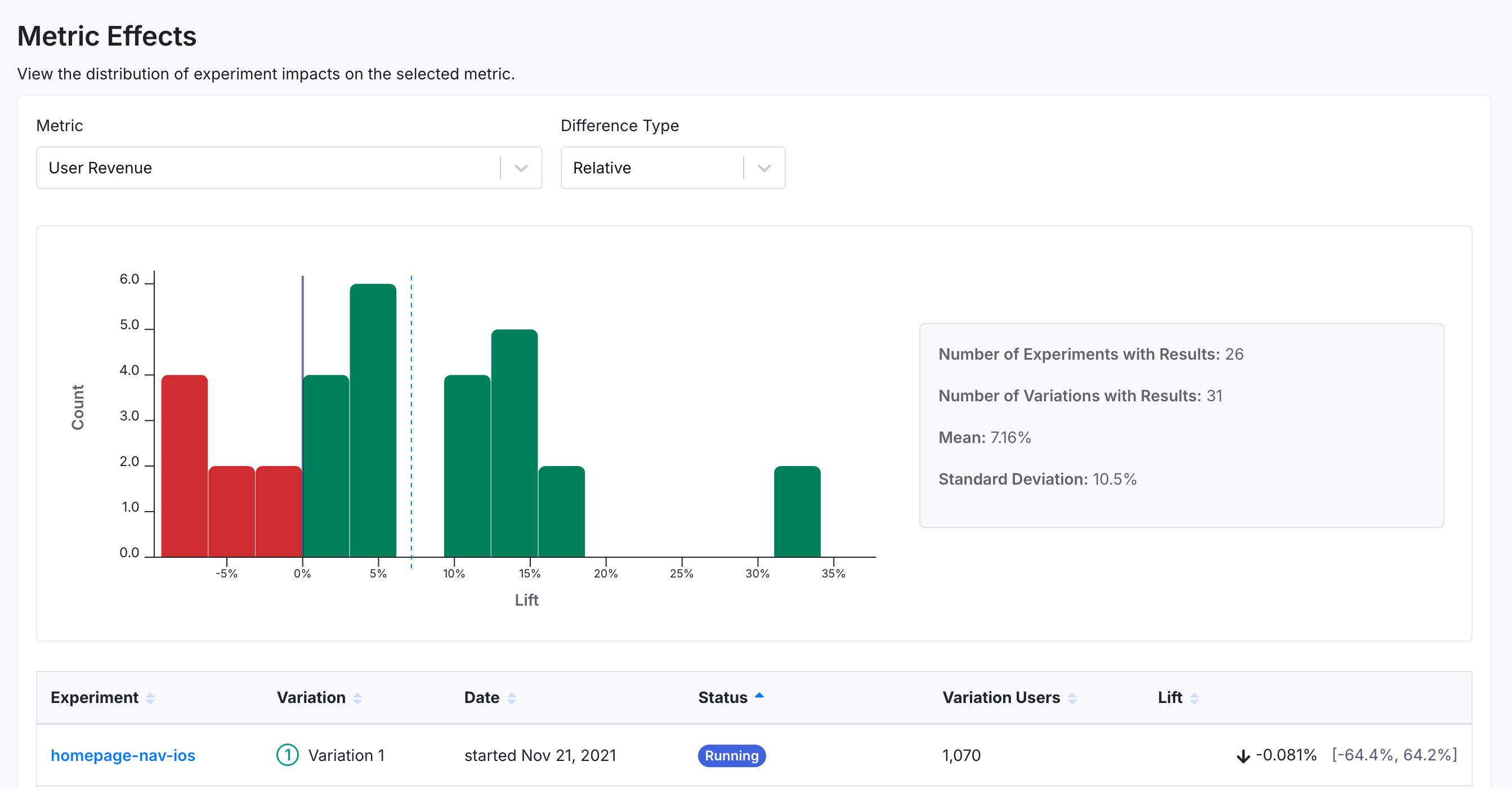
Metric Effects
Metric Correlations
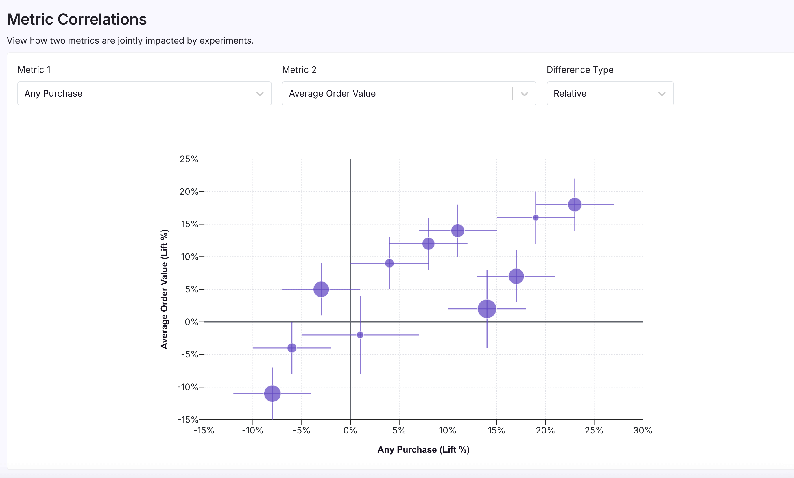
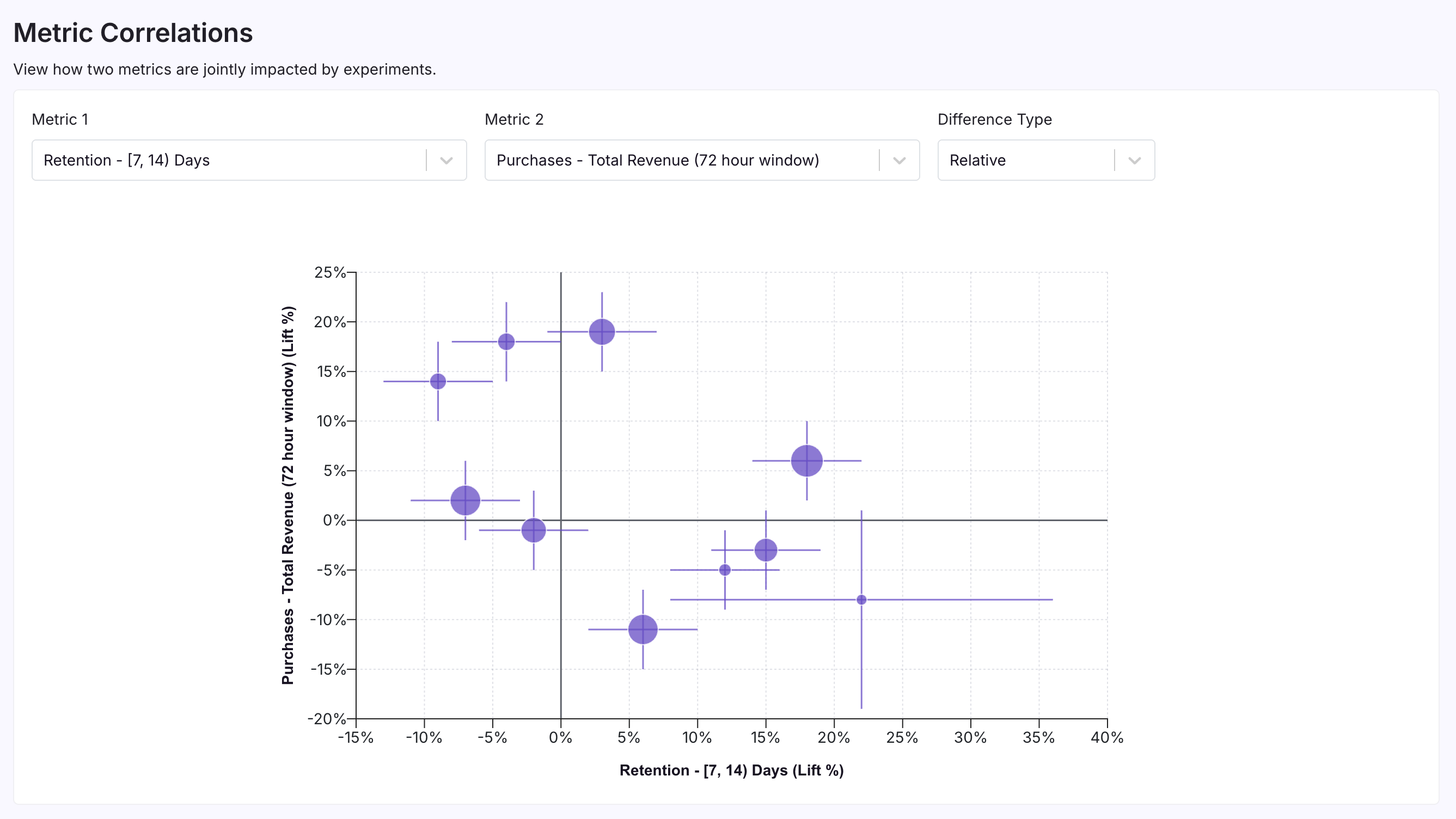
The Metric Correlations page allows you to visualize how experiments tend to jointly impact two metrics. Each dot on the plot is a variation from an experiment, with the size of the dot corresponding to the number of units and the lines corresponding to the error bars. This graph helps you answer questions like:- When my experiments increase one metric, are other metrics following suit?
- Is there any trade-off between maximizing one key metric and another key metric?